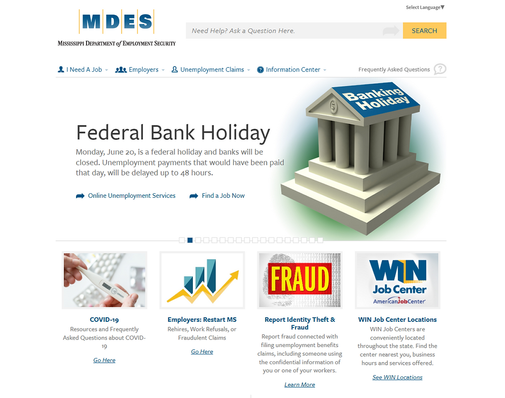
Case Study: Mississippi Unemployment Website
Hello, good day and good evening! My name is Jonathan Smith and I would love to showcase a mini case study i completed as part of my coursework for the Rice University UX/UI bootcamp. I along with my teammates completed this study over the course of a 4 week period.
Our Team.

What are we trying to solve?
For the first part of our mission, we asked ourselves "what can we add to the current Mississippi Unemployment to improve efficiency and overall user accessibility?" In other words, what can be done to improve the current site?
What needs to be fixed?
In order to gain a better grasp of the current unemployment site, we broke down the contents of the site via content audit and discovered a plethora of broken links, unorganized information and an unintuitive user flow.


Who can we help?
Quickly looking at our problem space, while there were pain points that affected pretty much all user groups such as the rise of Covid 19, we also noticed through our research that a majority of Veterans also cited seeking employment as one of the biggest hurdles of transitioning to civilian life. Most sites offer very little if any support for these Veterans, despite the opportunity they bring to end talent shortages.
User Persona
So after we constructed several user based interviews focusing on various pain points of the site, we created a user persona (Zach) who is a recent Vet looking to apply for a job in the civilian workforce.


"As a veteran, I need to easily access career development resources, so that I can successfully transition into the civilian workforce. "
User Problem Statement

Low Fidelity Prototypes


.png)
Lo fi prototypes
So here we see our first low-mid fidelity prototypes for the homescreens. Our goal was to make the site more accessible and we created a "additional services" tab as well as a career hub for veterans. We focused on contrast to better ensure users with visual impairments and/or possible color blindness would still be able to navigate the site.
Iterations and Style guide
After some A/B testing we discovered people do actually prefer the veteran services under the newly made "Additional services menu", and with that we began to develop a style guide to flesh out our High fidelity prototype, making accessibility our top priority. Looking at our new style guide (with appropriate red white and blue color scheme) we broke down each element into our new high fidelity prototype.


Career Hub
The Career Hub is our newly added feature. This portal will allow Veterans to get resume building tips, career coaches, community and support resources and more. Users will need a separate login for this portal and will have a way to address pain points veterans may face while transitioning to civilian life.

High Fidelity Prototype
This is your Team section. It's a great place to introduce your team and talk about what makes it special, such as your culture and work philosophy. Don't be afraid to illustrate personality and character to help users connect with your team.


.png)

Closing Thoughts
Overall we were able to complete our aim by completing a professional and accessible web design. Had we more time we would have done more research with users using our new design and measuring metrics such as user retention and number of clicks.


